Gathering this feedback is critical to building a valuable application and providing a pleasant user experience.
For Astro applications, feedback mechanisms should be deployable from anywhere and at any time. Whenever possible, they should never obscure content, intrude on interactive spaces, or disrupt workflow.
To collect meaningful feedback, use a balanced approach that considers a combination of question types optimized for the kind of information being sought, the application owner’s business goals, and the needs and aspirations of users. For example, a rating scale is a great way to quickly determine general user satisfaction with a certain feature or section, while an open-ended question coupled with a free text field is a better method for collecting more specific concerns.
Astro provides specific criteria to consider when deciding which feedback pattern to use: Question Types, Placement, and Best Practices.
Question Types
Close-ended questions provide data that can be directly compared between participants or between different versions of an application. Open-ended questions provide more flexibility, allowing the participant to elaborate on their thinking. Requests for visuals provide feedback involving screenshots uploaded by the user to illustrate an issue.
Yes/No Questions
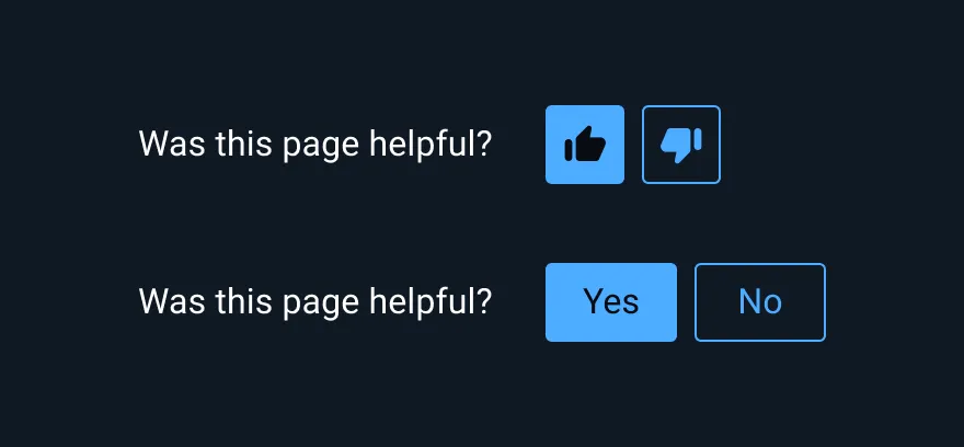
Use yes/no questions to capture both positive and negative sentiments about an experience in an application, such as Was this page helpful? These question types require little interaction cost from the user and help to gain a snapshot of a user’s experience; however, they do not offer further explanation.
Multiple-choice questions
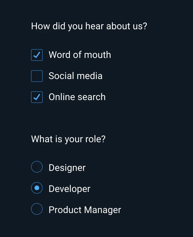
Use multiple-choice questions when the kinds of answers you will receive are already known, such as demographic questions like age ranges, industry, or location. These question types are often presented after submission of information, such as a checkout.
Ratings
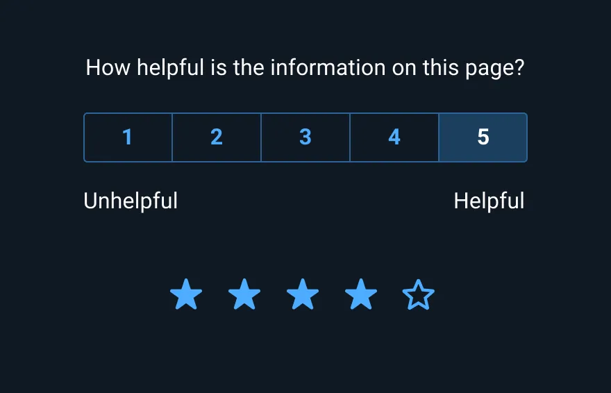
Use numeric rating scales to measure ease of use, satisfaction, likelihood to recommend, and feature importance. Rating scales are often displayed at the end of an experience and prompt the user to indicate how helpful a feature was or how difficult or easy the task was to complete.
Open-text questions
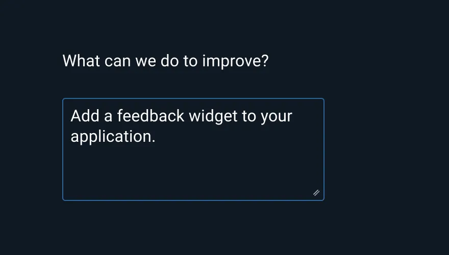
Use open-text questions to capture feedback when the likely response is unknown. These question types are often used to give additional explanation behind a numeric rating survey, but have a high interaction cost, so they should be used sparingly.
Requests for visuals
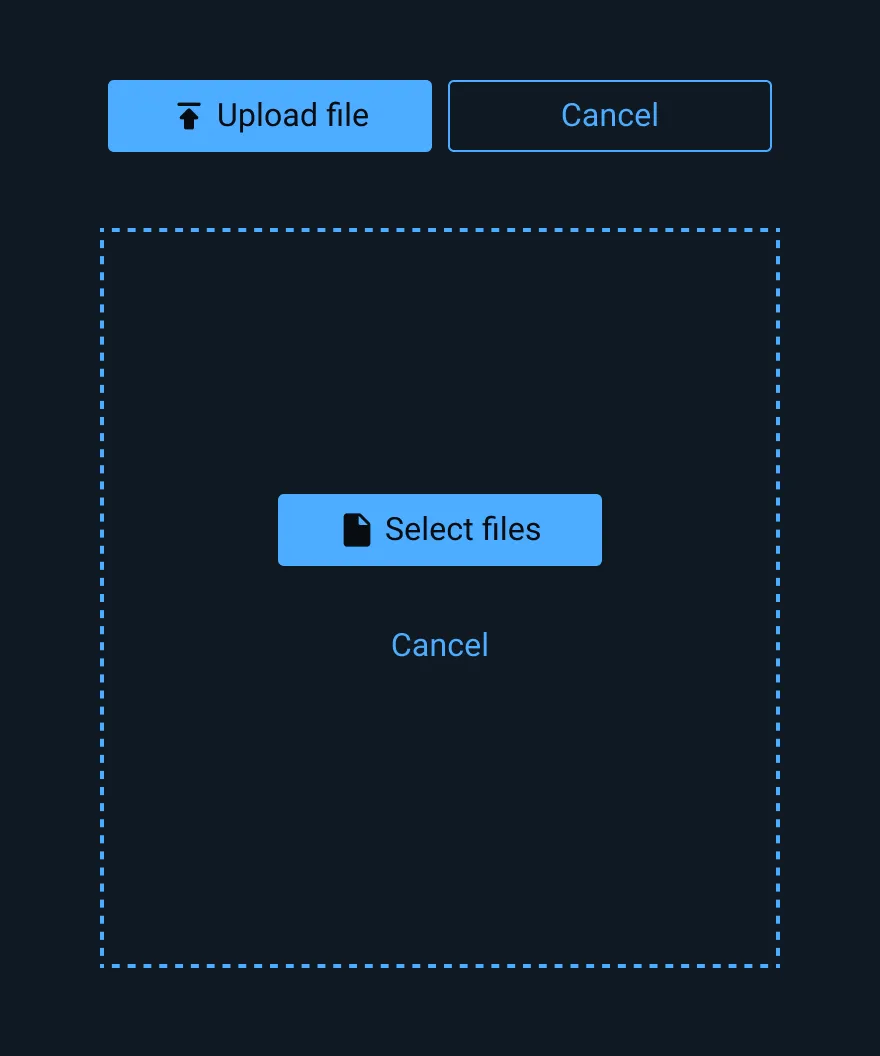
Use requests for visuals when it is easier to troubleshoot issues using a visual example rather than through words. These question types work well when reporting a bug or providing usability feedback.
Examples of Common Feedback Metrics
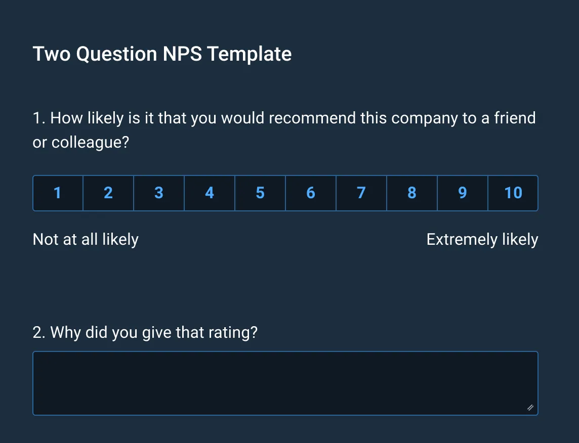
Net Promoter Score (NPS)
The NPS is a common feedback metric to measure overall customer satisfaction that consists of a question: Please rate how likely you are to recommend our product on a scale from 0 to 10. To better understand the chosen rating, additional questions can be added. To fully leverage the customer insights that this research provides, proper analysis of the NPS score is important – learn more at NPS Analysis: 6 Ways to Analyze Your NPS.
Customer Effort Score (CES)
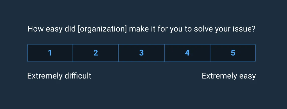
The CES is another common feedback metric that measures how much effort it takes for the user to complete a task on a scale of 1 to 5. CES data is collected in real-time after the user completes a task. It may appear directly after task completion on the webpage.
Placement
After determining the appropriate question types, choose a placement in the application that best matches the size of the feedback form and the level of detail required.
For example, a simple ratings widget would easily fit inline in the application alongside other page elements with little impact on the rest of the interface, while a list of multiple-choice questions in a similar location would be distracting from the main task and cumbersome to use, which could reduce response rate and user satisfaction with the application itself.
Common Placement Locations for Feedback Questions
Inline
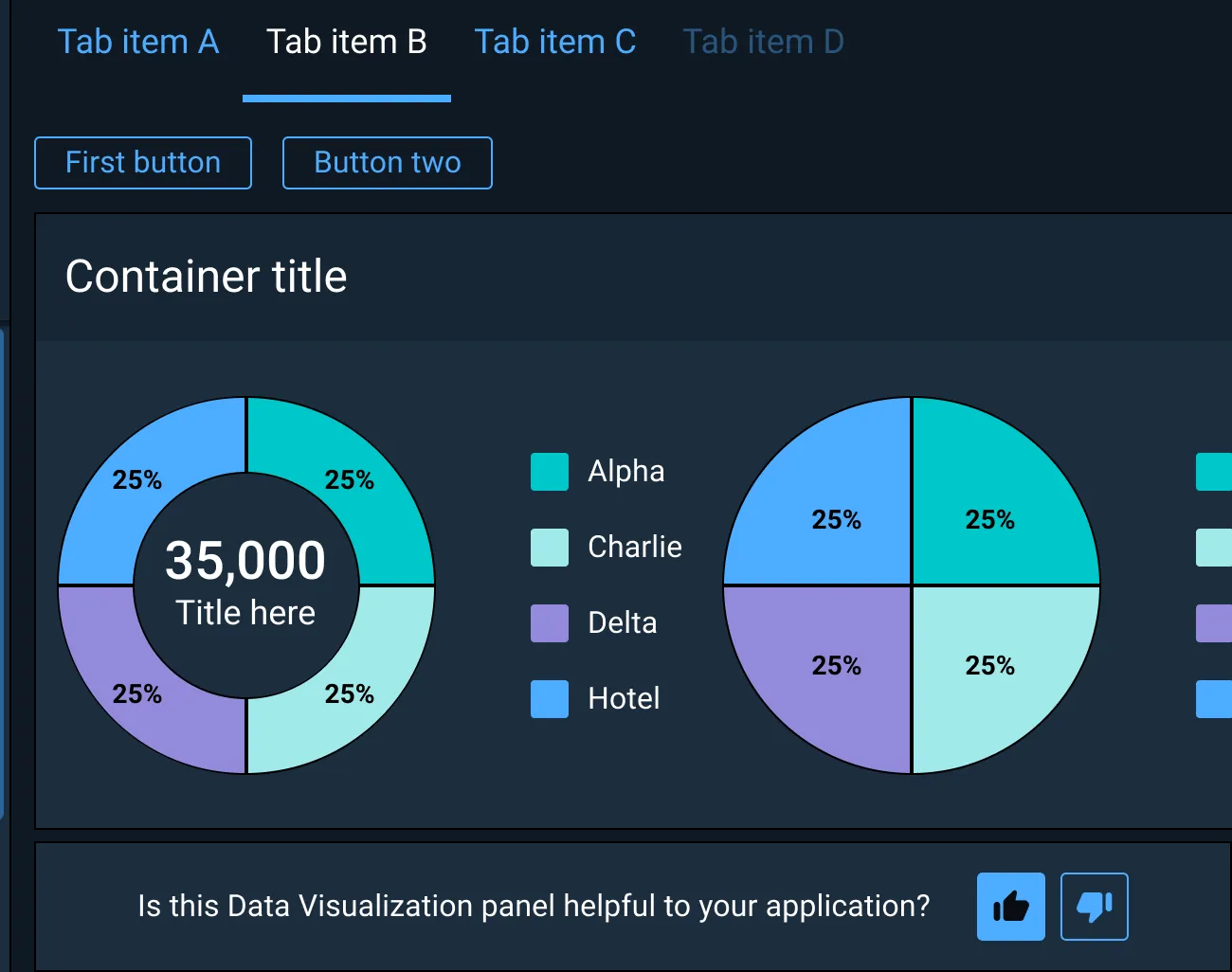
Use an inline feedback pattern for collecting short survey information while not distracting from the users’s workflow or obscuring parts of the interface. Inline feedback mechanisms are often displayed adjacent to a specific section of UI upon which survey information is to be collected.
In an overlay docked to a corner of the interface
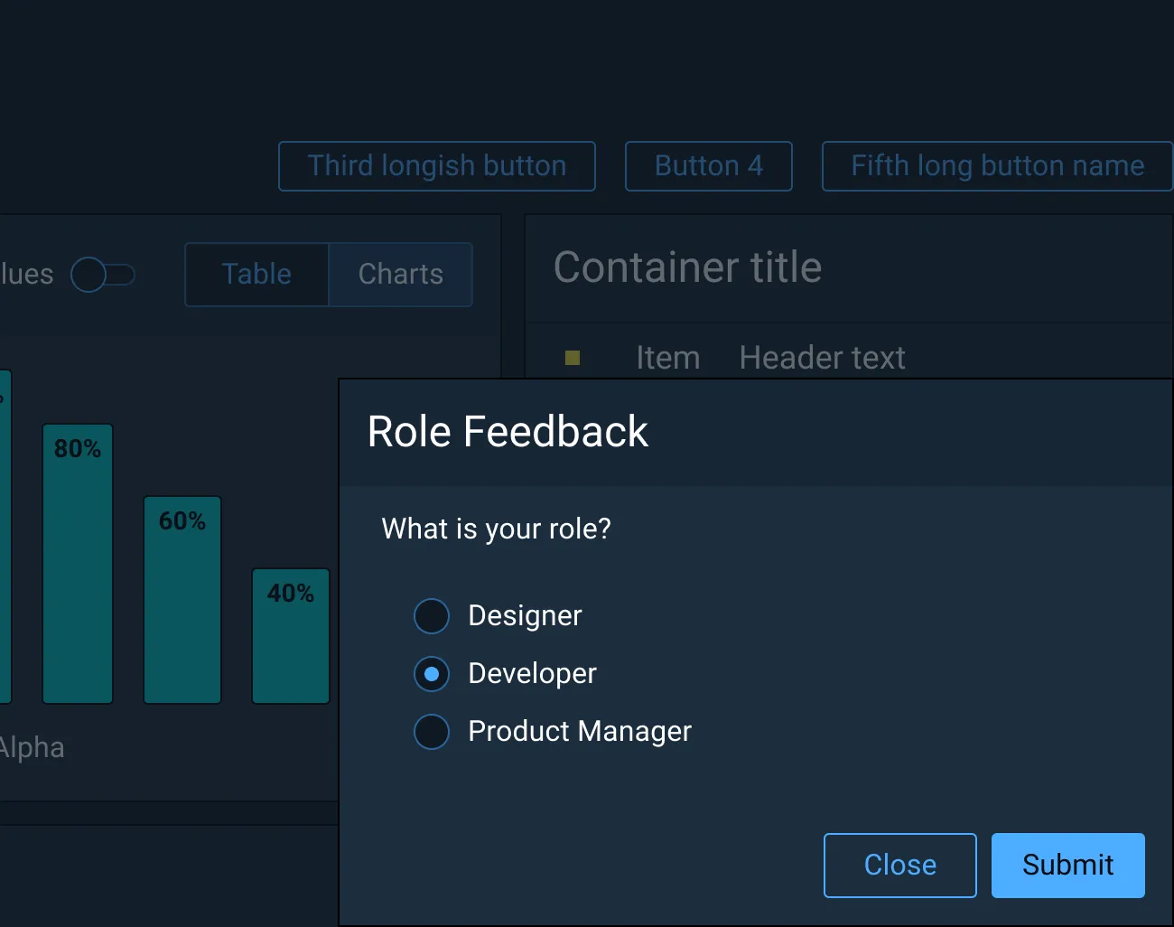
Docked overlays or composers are typically toolbars that are persistent in the interface that allow the user to expand or collapse more detailed feedback forms at their discretion. This is useful for applications that demand heightened user attention for critical tasks where a user may need to return to the feedback form at a later point to complete it.
On a separate full page
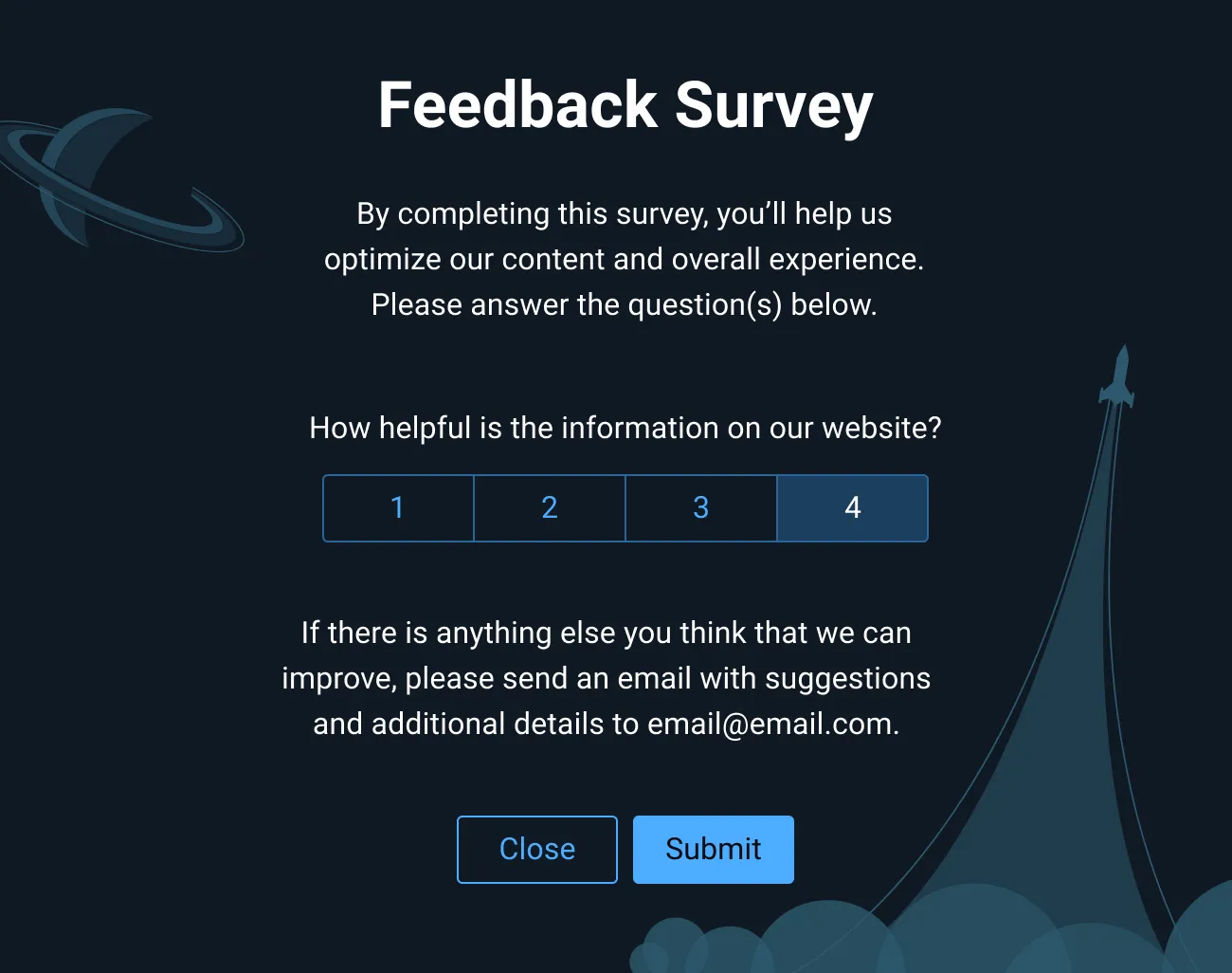
Use full-page feedback patterns for questions that require the user’s attention. With this option, it is critical to let the user know that their current workflow will be disrupted if they choose to move forward and they will be taken to a separate page. With this type of feedback pattern, it is possible to separate the survey content into multiple pages to capture a greater level of detail.
In a Modal Dialog
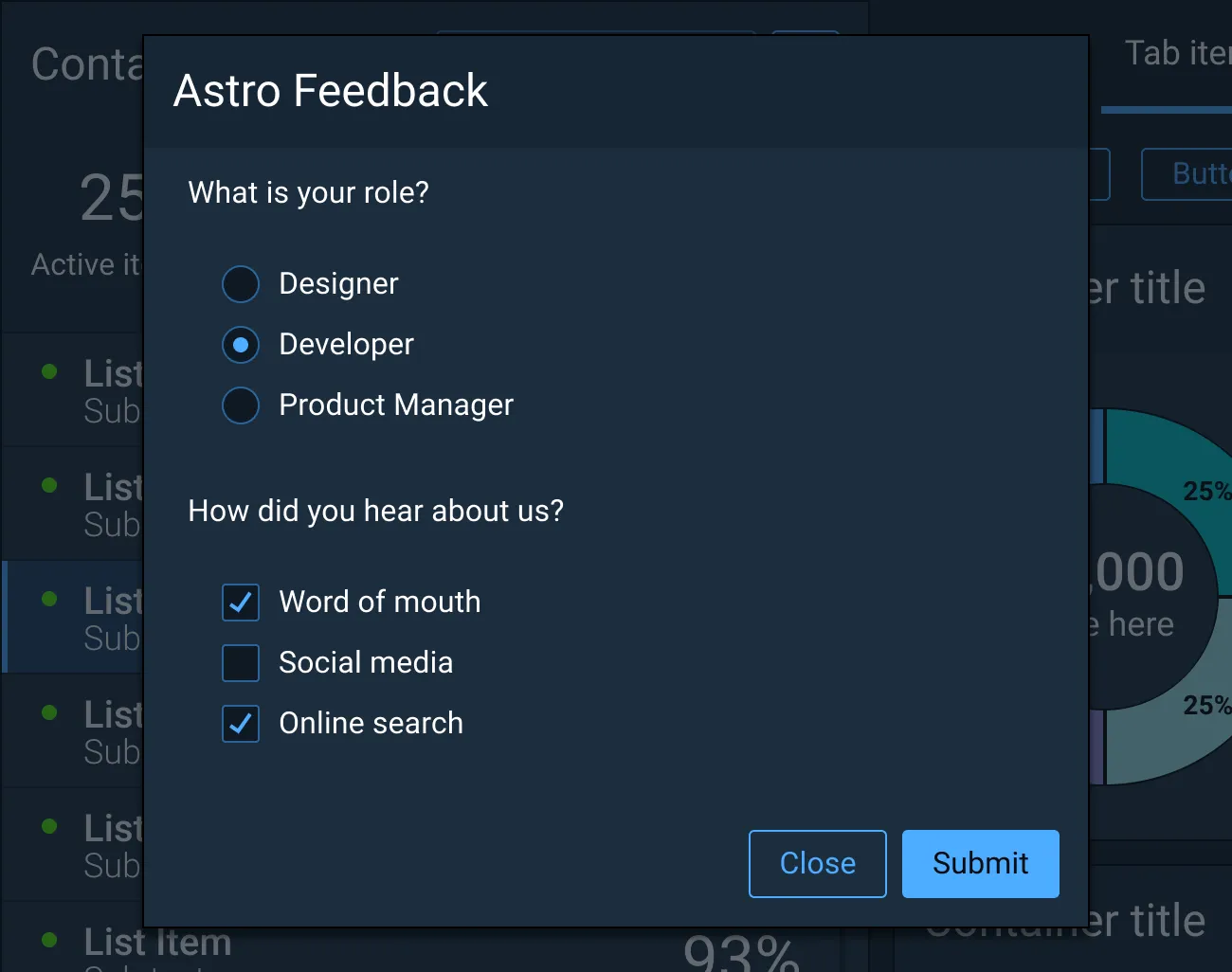
Use a Modal Dialog to hold the page context while presenting a survey to the user. This easily allows the user to return to their task without losing their place on the underlying page once the form has been submitted or dismissed. Modal Dialog feedback patterns are disruptive to the user’s workflow and should not be applied to applications with controls and displays that need to be accessible to users at all times.
In a Pop Up or Non-modal Dialog
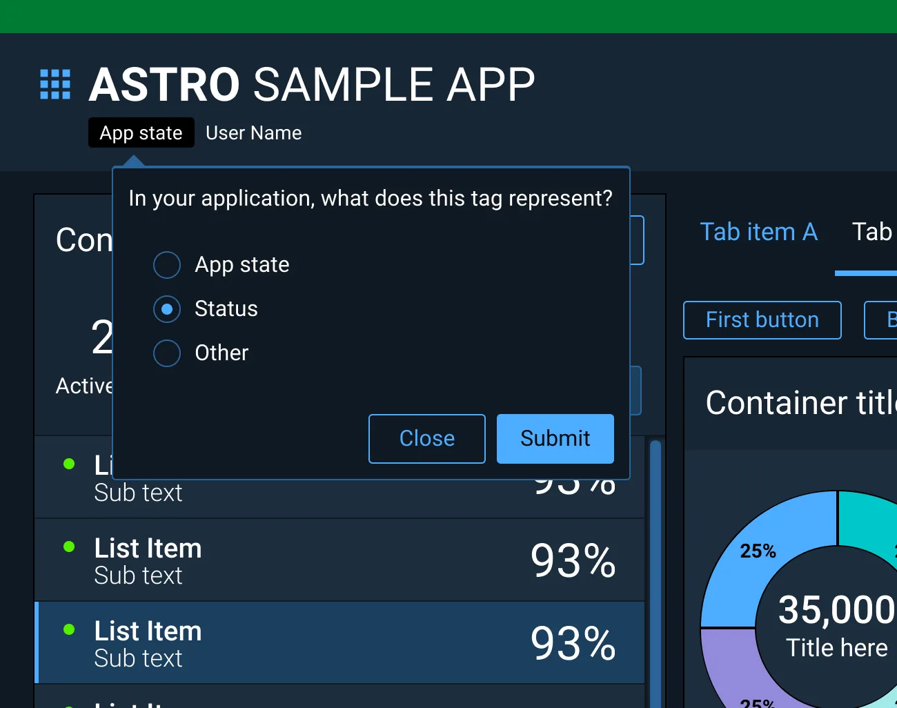
Use a Pop Up or Non-modal Dialog for simple feedback forms in applications where the user requires constant access to the UI controls and the displays. Pop Ups can be anchored to various trigger elements, giving them greater flexibility of placement within the interface and make them well suited for gathering feedback on specific UI features.
Best Practices
- Write clear and concise questions.
- Avoid non-essential questions that waste time collecting unnecessary information.
- Test questions with a pilot group to ensure desired response types.
- Use a combination of open-ended and close-ended questions to get a more rounded picture of user feedback.
- The more questions you ask users, the lower the completion rate, so limit surveys to ten questions.
- Survey completion rates tend to decrease if there is more than one open-text question, so aim for just one comment box (open-text) question.
- Ensure feedback requests never appear unexpectedly or hinder user progress.
References
Collecting User Feedback: 10 Best Practices | Adobe XD Ideas
In App Feedback Patterns - Lightning Design System
The ultimate guide to running a customer feedback program | SurveyMonkey
Asset Status
| Asset | Version | Status |
|---|---|---|
| Documentation | N/A | Available |